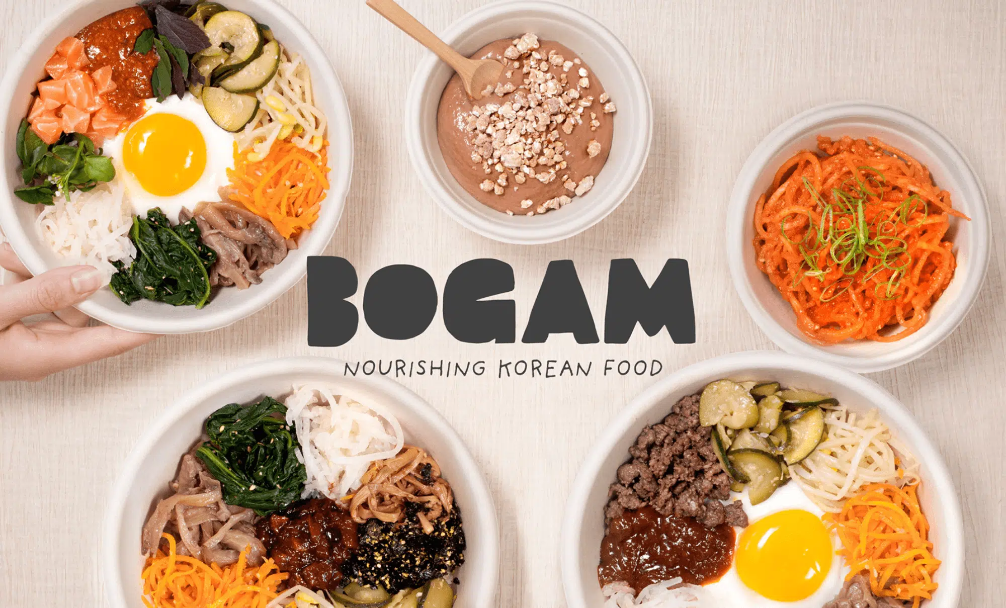
Bogam, food branding for a dark kitchen
summer 2022
Art direction
Positioning & Identity
In 2022, I’ve been commissioned to create a visual identity for Bogam, Korean cuisine concept, focused on bibimbap.
For their launch exclusively in delivery. they aimed to promote a healthy and nourishing alternative for delivery.
In line with the positioning, I brainstormed with the team to find the brand name, as well as a simple and direct tagline to launch their branding food.
I opted for a photographic artistic direction that highlights the quality of the ingredients. witch was particularly suitable to attract costumers on delivery platforms.
On printed materials, the muted color palette inspire trust and set Bogam apart from its competitors. indeed, Dark Kitchen branding and color codes are generally rather flashy.


Logo Design
To create the brand logos, I drew inspiration from the round and imperfect shapes of food.
taking inspiration in the disposition of a bibimbap, the « O » in Bogam becomes the egg in the center of the bowl surrounded by various preparations.
The main lettering is hand-drawn. A handwritten typography supports the logo and adds stability.

Creation of a cocooning delivery experience
For a dark kitchen, the delivery moment is the most significant point of contact.
While many digital brands opt for highly branded packaging, Bogam expresses itself in a more understated register. this, allow its product to shine.
In this particular case, where the visual presentation of the dishes was particularly well-crafted.
then, I also designed a flyer in order to highlights the composition of the bibimbap. This all-in-one dish as a particular mode of consumption.
Moreover, or each of the four recipes available at launch – Salmon, Beef, Vegetarian, and Vegan – I designed a round sticker with a color code is placed on the lid of the box. Thoses stickers allow take-away staff and customers to differenciate the recipes.
On delivery platforms, photography is key for a restaurant.
Artistic direction of the pohotography is indeed a key point for food branding.
My clients rely on delivery as a sales channel, and it’s an ecosystem with very specific codes.
My goal: to bridge the gap between the brand’s universe and the constraints of platforms (such as Deliveroo, Uber Eats, or others) in order to optimize conversions into orders.
Especially for Bogam, I decided to bring as much « tangibility » as possible.
The goal was to compensate for the absence of a physical restaurants with textured backgrounds, accessories, human presence in the imagery, and above all, soft and natural lighting.
Photography by Simon Kolton.

Psss, Want to see more Food Branding projects?
🍽️ Click here to see more!
Customer’s
word
“Marine as réussi à créer une identité convaincante pour notre marque dans un délai était très court. convaincante pour notre marque dans un délai très court et as été force de proposition sur le projet.”

Mathilde Rogard
Directrice Marketing
en charge du lancement
du projet.